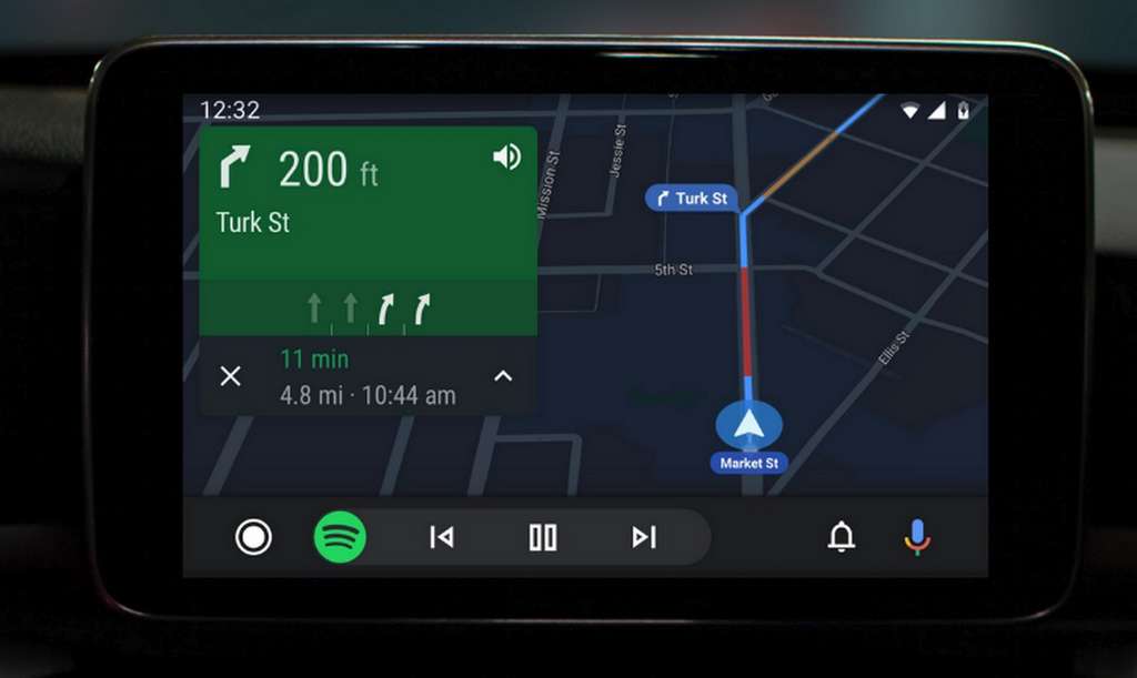
The Google OS for automotive infotainment systems is entitled to a significant update with, in particular, the introduction of a dark mode and more intuitive ergonomics.
Users of Android Auto will soon benefit from an update that will bring many improvements welcome. To start a new launcher on the Home screen has the icons of applications on a vertical scrolling grid that is much closer that found on an Android smartphone.
The navigation should be significantly improved compared to the current system with the five buttons fixed in the lower banner.
Another improvement that helps reduce driver distraction is the presence of a persistent and contextual navigation bar at the bottom of the screen. If, for example, you use assisted navigation while listening to music, the bar displays the “play/pause,” “next/previous” control buttons, so you do not have to leave the current application.
Likewise, if you are in your music app while navigating with Google Maps, the bar shows the next direction. This will help reduce the number of steps to travel in the interface and thus allow the driver to be more focused on the road.

Android Auto present in more than 500 car models
Very trendy currently on smartphones, the dark mode also arrives on Android Auto. This cosmetic addition improves visual comfort and brings greater homogeneity to the interface. The notification center has been enhanced to view recent calls, listen to messages, and view alerts.
Finally, Android Auto will adapt to the XL screens of some infotainment systems to fully exploit the available display surface.
Android Auto was introduced five years ago. According to Google, it is now present in more than 500 models of cars of 50 different brands. The update of the OS will be available later this summer.